Client Ministerie van Infrastructuur en Milieu, Gemeente Amsterdam en Prorail
Industry Governmental
Services Graphic Design, Creative direction, Interactive design, photography
In collaboration with Wit Communicatie


Client Ministerie van Infrastructuur en Milieu, Gemeente Amsterdam en Prorail
Industry Governmental
Services Graphic Design, Creative direction, Interactive design, photography
In collaboration with Wit Communicatie

Zuidasdok is the area that borders the A10 Zuid ring road and connects the Zuidas, Amsterdam’s business district, with city, rail and motorway. The Zuidas is mainly known as a premium international knowledge and business district. It is home to more than 700 companies. From Google, AkzoNobel and ABN Amro to Vrije Universiteit Amsterdam and VU University Medical Center. Some 30,000 people representing 35 nationalities work in the Zuidas.
This area is undergoing major changes. The plan involves redevelopment, a new station and diverting the motorway underground. The new station will be the largest transfer station for train, metro, bus and tram in the northern Randstad conurbation. Soon, traffic will move faster, more efficiently and in greater volumes under the Zuidas. A new residential area is planned.

None of this will go unnoticed, of course. People will be inconvenienced by the project, which will take until 2028. It is a multi-year and complex €1.9 billion construction task., making Zuidasdok the largest building project in Europe right now. The Zuidas district is characterised by metropolitanism, commercial interests combined with human scale, mega-dynamism, a 24-hour economy, pulsating energy and magnetism.
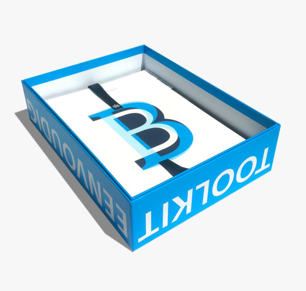
We developed the new Zuidasdok identity for the clients – the City of Amsterdam, Pro Rail and Rijkswaterstaat – to use in their communication. Together with Wit Communicatie, the Beautiful Minds design team incorporated the characteristics of Zuidas in a distinctive logo. This was a real challenge, with three partners each with their own stature together forming a single identity. We developed a collective identify for them, that reflects the variety of people who work, live and pass through the Zuidas in the logo. Because it is the people that colour the Zuidas identity.


Met zoveel partijen en een klankbordgroep van 200 experts, moet je als designteam veerkrachtig zijn. Wij smeedden met auteur Peter Heerema alle consultatierondes en het geheel aan teksten, adviezen, schetsen en graphics uiteindelijk samen tot één publicatie, niet groter dan 1 usb stick! En dat scheelt drukwerk.
En we gaven vorm aan content die nog nooit eerder was gevisualiseerd. In ‘bierviltjes’-sessies werden met de hand scenario’s getekend, die we vertaalden naar infographics. Zo gaven we inzicht in gegevens en vooruitzichten, zoals de stijgende zeespiegel en de verandering van de kust door de tijd. Want beeld spreekt tot de verbeelding en dat helpt mensen om snel complexe gegevens te begrijpen.


Asterweg 20 E3
1031 HN Amsterdam
+31 (0)20 – 494 3111
info@beautifulminds.nl
© 2017 Beautiful Minds